import os
import numpy as np
import matplotlib
import matplotlib.pyplot as plt
import librosa
import librosa.display
import scipy
import IPython.display as ipd
from IPython.display import Image3.3. 단기 푸리에 변환 (STFT) (1)
Short-Term Fourier Transform (1)
푸리에변환
STFT
스펙트로그램
단기 푸리에 변환(STFT)를 소개하고, 이와 관련된 윈도우(window), 스펙트로그램(spectrogram), 패딩(padding) 전략 등을 살펴본다.
이 글은 FMP(Fundamentals of Music Processing) Notebooks을 참고로 합니다.
이산(Discrete) 단기 푸리에 변환 (Short-Time Fourier Transform, STFT)
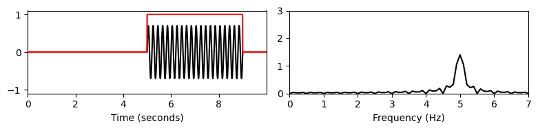
“Missing Time Localization”
- 기존 푸리에 변환은 전체 시간 영역에서 평균화되는 주파수 정보를 생성한다. 그러나 이러한 주파수가 언제 벌생하는지에 대한 정보는 변환에 숨겨져 있다. 이 현상은 다음 그림을 보면 알 수 있다.
Fs = 128
duration = 10
omega1 = 1
omega2 = 5
N = int(duration * Fs)
t = np.arange(N) / Fs
t1 = t[:N//2]
t2 = t[N//2:]

x1 = 1.0 * np.sin(2 * np.pi * omega1 * t1)
x2 = 0.7 * np.sin(2 * np.pi * omega2 * t2)
x = np.concatenate((x1, x2))

plt.figure(figsize=(8, 2))
plt.subplot(1, 2, 1)
plt.plot(t, x)
plt.xlim([min(t), max(t)])
plt.xlabel('Time (seconds)')

plt.subplot(1, 2, 2)
X = np.abs(np.fft.fft(x)) / Fs
freq = np.fft.fftfreq(N, d=1/Fs)
X = X[:N//2]
freq = freq[:N//2]
plt.plot(freq, X)
plt.xlim([0, 7])
plt.ylim([0, 3])
plt.xlabel('Frequency (Hz)')
plt.tight_layout()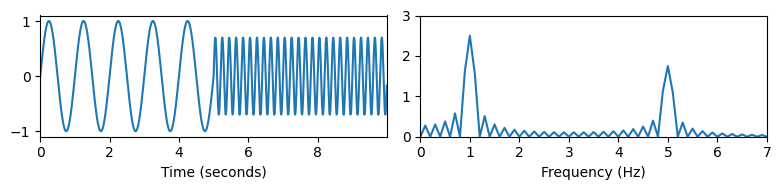
Image("../img/3.fourier_analysis/f.2.6.PNG", width=600)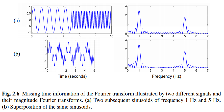
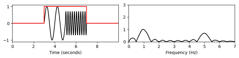
기본 개념
- 숨겨진 시간 정보를 복구하기 위해 Dennis Gabor는 1946년에 단시간 푸리에 변환(STFT)을 도입했다.
- 전체 신호를 고려하는 대신 STFT는 신호의 작은 부분만 고려한다. 이를 위해 짧은 시간 동안의 non-zero 함수, 소위 윈도우 함수(window function)를 고정한다. 그런 다음 원래 신호에 윈도우 함수를 곱하여 윈도우(windowed) 신호를 생성한다.
- 서로 다른 시간 인스턴스에서 주파수 정보를 얻으려면 시간에 따라 윈도우 함수를 이동하고, 각 결과 윈도우 신호에 대해 푸리에 변환을 계산해야 한다.
def windowed_ft(t, x, Fs, w_pos_sec, w_len):
    N = len(x)
    w_pos = int(Fs * w_pos_sec)
    w_padded = np.zeros(N)
    w_padded[w_pos:w_pos + w_len] = 1
    x = x * w_padded

    X = np.abs(np.fft.fft(x)) / Fs
    freq = np.fft.fftfreq(N, d=1/Fs)
    X = X[:N//2]
    freq = freq[:N//2]

    plt.figure(figsize=(8, 2))

    plt.subplot(1, 2, 1)
    plt.plot(t, x, c='k')
    plt.plot(t, w_padded, c='r')
    plt.xlim([min(t), max(t)])
    plt.ylim([-1.1, 1.1])
    plt.xlabel('Time (seconds)')

    plt.subplot(1, 2, 2)
    plt.plot(freq, X, c='k')
    plt.xlim([0, 7])
    plt.ylim([0, 3])
    plt.xlabel('Frequency (Hz)')
    plt.tight_layout()

print('서로다른 window 변화에 대한 실험:')

w_len = 4 * Fs
windowed_ft(t, x, Fs, w_pos_sec=1, w_len=w_len) # 윈도우 신호 t=1 중심
windowed_ft(t, x, Fs, w_pos_sec=3, w_len=w_len) # t=3
windowed_ft(t, x, Fs, w_pos_sec=5, w_len=w_len) # t=5
plt.show()
서로다른 window 변화에 대한 실험: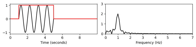
윈도우(window)
STFT는 원래 신호의 속성뿐만 아니라 윈도우 함수의 속성도 반영한다는 점에 유의해야 한다.
우선 STFT는 섹션의 크기를 결정하는 윈도우의 길이에 따라 달라진다. 그리고 STFT는 윈도우 모양의 영향을 받는다. 예를 들어 직사각형 윈도우를 사용하면 일반적으로 단면 경계에서 불연속성이 발생하기 때문에 큰 단점이 있다. 이러한 급격한 변화는 전체 주파수 스펙트럼에 걸쳐 전파되는 간섭으로 인해 부작용을 발생시킨다: ripple artifacts.
윈도우 유형
이러한 경계 효과를 줄이기 위해 원하는 섹션 내에서 섹션의 경계를 향해 연속적으로 0으로 떨어지는 음이 아닌 윈도우를 사용한다. 그러한 예 중 하나는 훨씬 더 작은 ripple artifact를 초래하는 삼각형 윈도우(triangular winow) 이다.
신호 처리에 자주 사용되는 윈도우는 Hann 윈도우(기상학자 Julius von Hann의 이름을 따서 명명됨, 1839~1921)이다. Hann 윈도우는 상승하는 코사인 윈도우로, 섹션 경계에서 스무스(smoothly)하게 0으로 떨어진다. 이는 윈도우 신호의 푸리에 변환에서 부작용을 완화한다. 그러나 단점은 Hann 윈도우가 약간의 주파수 번짐을 유발한다는 것이다.
결과적으로 신호의 윈도우 영역의 푸리에 변환은 신호의 속성이 제안하는 것보다 더 스무스해 보일 수 있다. 즉, ripple artifact의 감소는 더 안좋은 spectral localization을 통해 달성된다 (trade-off 관계).
def windowed_ft2(t, x, Fs, w_pos_sec, w_len, w_type, upper_y=1.0):

    N = len(x)
    w_pos = int(Fs * w_pos_sec)
    w = np.zeros(N)
    w[w_pos:w_pos + w_len] = scipy.signal.get_window(w_type, w_len)
    x = x * w

    plt.figure(figsize=(8, 2))

    plt.subplot(1, 2, 1)
    plt.plot(t, x, c='k')
    plt.plot(t, w, c='r')
    plt.xlim([min(t), max(t)])
    plt.ylim([-1.1, 1.1])
    plt.xlabel('Time (seconds)')

    plt.subplot(1, 2, 2)
    X = np.abs(np.fft.fft(x)) / N * 2
    freq = np.fft.fftfreq(N, d=1/Fs)
    X = X[:N//2]
    freq = freq[:N//2]
    plt.plot(freq, X, c='k')
    plt.xlim([0, 50])
    plt.ylim([0, upper_y])
    plt.xlabel('Frequency (Hz)')
    plt.tight_layout()
    plt.show()
duration = 2.0
Fs = 2000
omega = 10
N = int(duration * Fs)
t = np.arange(N) / Fs
x = 0.9 * np.sin(2 * np.pi * omega * t * t)
plt.figure(figsize=(8, 2))
plt.subplot(1, 2, 1)
plt.plot(t, x, c='k')
plt.xlim([t[0], t[-1]])
plt.ylim([-1.1, 1.1])
plt.xlabel('Time (seconds)')
plt.subplot(1, 2, 2)
X = np.abs(np.fft.fft(x)) / N * 2
freq = np.fft.fftfreq(N, d=1/Fs)
X = X[:N//2]
freq = freq[:N//2]
plt.plot(freq, X, c='k')
plt.xlim([0, 50])
plt.ylim(bottom=0)
plt.xlabel('Frequency (Hz)');
plt.tight_layout()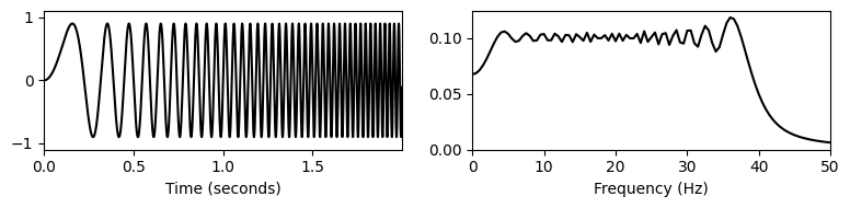
w_len = 1024
w_pos = 1280
print('Rectangular window:')
windowed_ft2(t, x, Fs, 1.0, w_len, 'boxcar', upper_y=0.15)
print('Triangular window:')
windowed_ft2(t, x, Fs, 1.0, w_len, 'triang', upper_y=0.15)
print('Hann window:')
windowed_ft2(t, x, Fs, 1.0, w_len, 'hann', upper_y=0.15)
Rectangular window: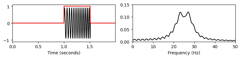
Triangular window: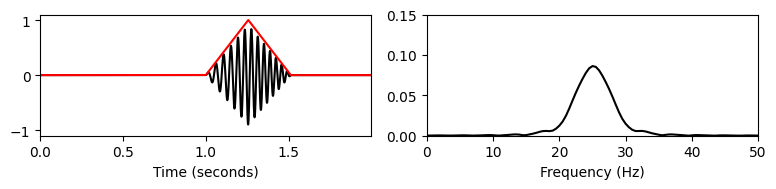
Hann window: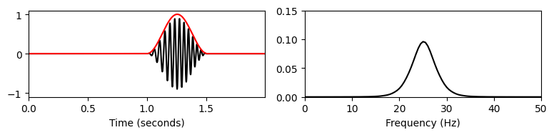
Discrete-STFT의 정의
이제 STFT의 이산적 사례를 고려하고 실제 적용에 필요한 가장 중요한 수학 공식을 구체화해보자.
\(x:[0:L-1]:=\{0,1,\ldots,L-1\}\to{\mathbb R}\)가 길이 \(L\)의 실수 값 이산 시간(DT) 신호라고 가정하자. 이는 헤르츠(Hertz)로 주어진 고정 샘플링 비율 \(F_\mathrm{s}\)에 대해 등거리(equidistant) 샘플링에 의해 얻어진다.
\(w:[0:N-1]\to\mathbb{R}\)를 길이 \(N\in\mathbb{N}\)의 표본 윈도우 함수라고 하자. 예를 들어 직사각형 윈도우의 경우 \(w(n)=1\) for \(n\in[0:N-1]\)이다. 길이 파라미터 \(N\)는 해당 섹션의 기간을 결정하며 이는 \(N/F_\mathrm{s}\)초에 해당된다.
홉 크기(hop size)라고 하는 추가 파라미터 \(H\in\mathbb{N}\)를 도입한다. 홉 크기 파라미터는 샘플에 지정되며 신호에서 윈도우가 이동하는 단계 크기(step size)를 결정한다. 이러한 파라미터와 관련하여 신호 \(x\)의 이산 STFT \(\mathcal{X}\)는 다음과 같다. \[ \mathcal{X}(m,k):= \sum_{n=0}^{N-1} x(n+mH)w(n)\mathrm{exp}(-2\pi ikn/N) \] with \(m\in[0:M]\) and \(k\in[0:K]\)
\(M:=\lfloor \frac{L-N}{H} \rfloor\)는 윈도우 시간 범위가 신호의 시간 범위에 완전히 포함되도록 하는 최대 프레임 인덱스(maximal frame index)이다(나중에 패딩(padding) 전략을 사용하는 일부 변형을 볼 것).
또한 \(K=N/2\)(\(N\)이 짝수라고 가정)는 Nyquist 주파수에 해당하는 주파수 인덱스이다.
복소수 $ (m,k)$는 \(m^{\mathrm{th}}\) 시간 프레임에 대한 \(k^{\mathrm{th}}\) 푸리에 계수를 나타낸다.
각 고정 시간 프레임 \(m\)에 대해, 0에 대한 계수 \(\mathcal{X}(m,k)\) for \(k\in[0:K]\)에 의해 주어진 크기 \(K+1\)의 스펙트럼 벡터(spectral vector) 를 얻는다.
이러한 각 스펙트럼 벡터의 계산은 \(N\) 크기의 DFT에 해당하며 FFT를 사용하여 효율적으로 수행될 수 있다.
스펙트로그램 (Spectrogram)
- 스펙트로그램은 STFT의 제곱 크기를 2차원으로 표현한 것이다.
\[\begin{eqnarray} \mathcal{Y}(m,k):= | \mathcal{X}(m,k)|^2. \end{eqnarray}\]
Image("../img/3.fourier_analysis/f.2.9.PNG", width=600)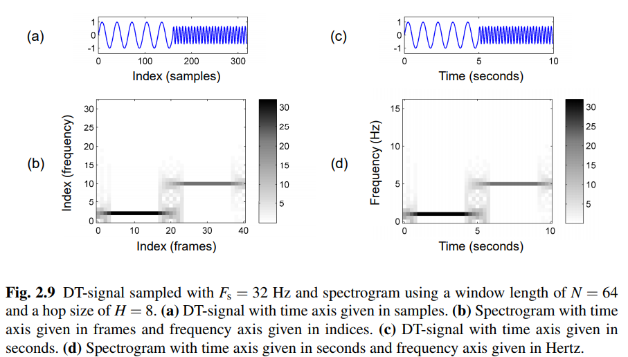
- 수평축은 시간을 나타내고 수직축은 주파수를 나타내는 2차원 이미지를 통해 시각화할 수 있다. 이 이미지에서 스펙트로그램 값 \(\mathcal{Y}(m,k)\)는 좌표 \((m,k)\)에서 이미지 색상 또는 강도로 표시된다. 단, 이산형의 경우 시간축은 프레임 인덱스 \(m\)로, 주파수 축은 주파수 인덱스 \(k\)로 지수화된다.
def stft_basic(x, w, H=8, only_positive_frequencies=False):
    """Compute a basic version of the discrete short-time Fourier transform (STFT)

    Args:
        x (np.ndarray): Signal to be transformed
        w (np.ndarray): Window function
        H (int): Hopsize (Default value = 8)
        only_positive_frequencies (bool): Return only positive frequency part of spectrum (non-invertible)
            (Default value = False)

    Returns:
        X (np.ndarray): The discrete short-time Fourier transform
    """
    N = len(w)
    L = len(x)
    M = np.floor((L - N) / H).astype(int) + 1
    X = np.zeros((N, M), dtype='complex')
    for m in range(M):
        x_win = x[m * H:m * H + N] * w
        X_win = np.fft.fft(x_win)
        X[:, m] = X_win

    if only_positive_frequencies:
        K = 1 + N // 2
        X = X[0:K, :]
    return X
H = 8
N = 128
w = np.ones(N)
X = stft_basic(x, w, H, only_positive_frequencies=True)
Y = np.abs(X) ** 2
plt.figure(figsize=(3, 4))
plt.subplot(2, 1, 1)
plt.plot(np.arange(len(t)), x, c='k')
plt.xlim([0, len(t)])
plt.xlabel('Index (samples)')
plt.subplot(2, 1, 2)
plt.imshow(Y, origin='lower', aspect='auto', cmap='gray_r')
plt.xlabel('Index (frames)')
plt.ylabel('Index (frequency)')
plt.tight_layout()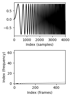
윈도우 유형에 따른 스펙트로그램 차이
- 예시의 chirp 신호:
- \(f(t)=\sin(400\pi t^2) \mathrm{\quad for \quad } t\in[0,1],\)
- \(t=1\)을 향해 페이드 아웃된다. 이 처프의 경우 순간 주파수는 \(t=0\)에서 \(\omega = 0~\mathrm{Hz}\)에서 \(t=1\)에서 \(\omega = 400~\mathrm{Hz}\)로 선형적으로 증가한다.
# chirp signal 생성
duration = 1.0
Fs = 4000
N = int(duration * Fs)
t = np.arange(0, N) / Fs
x = np.sin(np.pi * 400 * t * t)

size_fade = 256
w_fade = np.hanning(size_fade * 2)[size_fade:]
x[-size_fade:] *= w_fade

ipd.display(ipd.Audio(x, rate=Fs))

plt.figure(figsize=(5, 1.5))
plt.plot(t, x, c='gray')
plt.xlabel('Time (seconds)')
plt.xlim( [t[0], t[-1]] );
plt.tight_layout()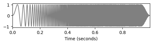
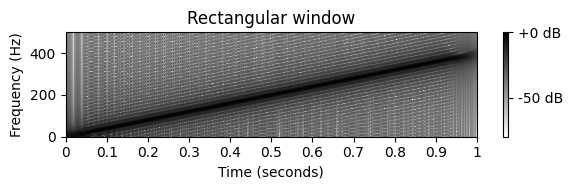
- STFT를 계산하기 위해 \(62.5\)msec 크기의 직사각형 윈도우과 Hann 윈도우를 사용하자.
- 스펙트로그램의 이미지는 처프 신호의 선형 주파수 증가를 나타내는 강한 대각선 줄무늬를 보여준다.
- 윈도우는 푸리에 영역에서 약간의 주파수 번짐과 추가적 부산물을 만든다. 이는 강한 대각선 위아래로 있는 약한 대각선 줄무늬르 보면 알 수 있다. 이러한 약한 줄무늬는 윈도우 함수의 푸리에 변환에서 발생하는 ripple(잔물결)에 해당한다.
- Hann 윈도우 대신 직사각형 윈도우을 사용할 때 ripple artifacts가 더 강하다는 것을 관찰할 수 있다.
- 일반적으로는 신호의 특성과 윈도우 함수에 의해 초래하는 효과를 구분하기는 쉽지 않다.
w_len_ms = 62.5
N = int((w_len_ms / 1000) * Fs)
H = 4
X_hann = librosa.stft(x, n_fft=N*16, hop_length=H, win_length=N, window='hann', center=True, pad_mode='constant') # Hann
X_rect = librosa.stft(x, n_fft=N*16, hop_length=H, win_length=N, window='boxcar', center=True, pad_mode='constant') # 직사각형plt.figure(figsize=(6, 2))
librosa.display.specshow(librosa.amplitude_to_db( np.abs(X_hann), ref=np.max),
y_axis='linear', x_axis='time', sr=Fs, hop_length=H, cmap='gray_r')
plt.clim([-80, 0])
plt.ylim([0, 500])
plt.xlim([0, 1])
plt.colorbar(format='%+2.0f dB')
plt.xlabel('Time (seconds)')
plt.ylabel('Frequency (Hz)')
plt.title('Hann window')
plt.tight_layout()
plt.figure(figsize=(6, 2))
librosa.display.specshow(librosa.amplitude_to_db( np.abs(X_rect), ref=np.max),
y_axis='linear', x_axis='time', sr=Fs, hop_length=H, cmap='gray_r')
plt.clim([-80, 0])
plt.ylim([0, 500])
plt.xlim([0, 1])
plt.colorbar(format='%+2.0f dB')
plt.xlabel('Time (seconds)')
plt.ylabel('Frequency (Hz)')
plt.title('Rectangular window')
plt.tight_layout()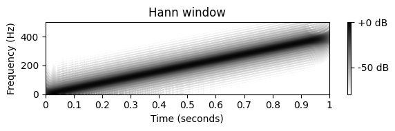
윈도우 크기에 따른 스펙트로그램 차이
- 예시의 신호:
- \(f(t)=\sin (800\pi t)+\sin (900\pi t) + \delta(t-0.45) + \delta(t-0.5) \mathrm{\quad for \quad } t\in[0,1]\)
- \(f\)는 각각 주파수 \(400\) 및 \(450~\mathrm{Hz}\)의 두 정현파의 중첩(superposition)이다. 또한 \(t=0.45\) 및 \(t=0.5\) 초에 두 개의 임펄스(impulse)가 추가된다. \(f\)는 표시된 구간 \([0,1]\) 밖에서는 0이라고 가정한다.
# 신호 생성
duration = 1.0
Fs = 4000
N = int(duration * Fs)
t = np.arange(N) / Fs
x = np.sin(2 * np.pi * 400 * t) + np.sin(2 * np.pi * 450 * t)
x[int(round(0.45 * Fs))] = 10
x[int(round(0.50 * Fs))] = 10

ipd.display(ipd.Audio(x, rate=Fs))

plt.figure(figsize=(5, 1.5))
plt.plot(t, x, c='gray')
plt.xlabel('Time (seconds)')
plt.xlim( [t[0], t[-1]] )
plt.tight_layout()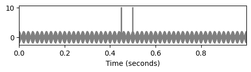
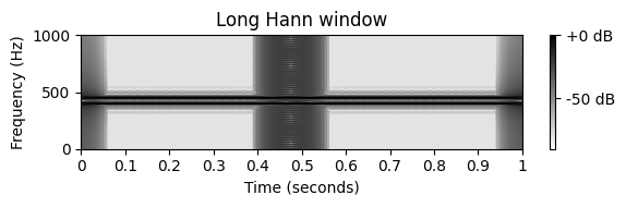
- 스펙트로그램을 계산하기 위해 다양한 크기의 Hann 윈도우를 사용해보자.
- \(32\) msec의 크기를 사용하여 스펙트로그램에서 정현파에 해당하는 \(375\)와 \(475~\mathrm{Hz}\) 사이의 영역에서 가로 줄무늬를 관찰할 수 있고, 임펄스(impulses)에 해당하는 \(t=0.45\)와 \(t=0.5~\sec\)에서의 두 수직 줄무늬를 관찰할 수 있다.
- 두 개의 임펄스가 명확하게 분리될 수 있지만(각 \(32\) msec 윈도우에는 최대 하나의 임펄스가 있음), \(\omega=400~\mathrm{Hz}\) 및 \(\omega=450 ~\mathrm{Hz}\)에서의 두 주파수 구성요소는 잘 분리되지 않는다(선택한 윈도우에 의해 도입된 주파수 번짐으로 인해).
- 윈도우 크기를 늘리면 상황이 달라진다. 예를 들어 \(128\) msec 크기의 Hann 윈도우를 사용하면 2개의 가로 줄무늬로 표시된 것처럼 2개의 주파수 구성 요소가 명확하게 분리된다. 그러나 윈도우 크기를 늘리면 시간 영역에서 번짐이 증가한다. 결과적으로 두 임펄스가 더 이상 분리되지 않는다.
- 여담으로 \(t=0\) 및 \(t=1\)에 표시되는 두 개의 세로 줄무늬를 보면 이는 표시된 시간 간격을 벗어난 제로 패딩(zero-padding)의 결과이다.
w_len_ms = 32
N = int((w_len_ms / 1000) * Fs)
H = 16
X_short = librosa.stft(x, n_fft=N*16, hop_length=H, win_length=N, window='hann', center=True, pad_mode='constant')

w_len_ms = 128
N = int((w_len_ms / 1000) * Fs)
H = 16
X_long = librosa.stft(x, n_fft=N*16, hop_length=H, win_length=N, window='hann', center=True, pad_mode='constant')
C:\Users\JHCho\anaconda3\envs\mir\lib\site-packages\librosa\util\decorators.py:88: UserWarning: n_fft=8192 is too small for input signal of length=4000
return f(*args, **kwargs)plt.figure(figsize=(6,2))
librosa.display.specshow(librosa.amplitude_to_db(np.abs(X_short), ref=np.max),
y_axis='linear', x_axis='time', sr=Fs, hop_length=H, cmap='gray_r')
plt.clim([-90, 0])
plt.ylim([0, 1000])
plt.xlim([0, 1])
plt.colorbar(format='%+2.0f dB')
plt.xlabel('Time (seconds)')
plt.ylabel('Frequency (Hz)')
plt.title('Short Hann window')
plt.tight_layout()
plt.figure(figsize=(6,2))
librosa.display.specshow(librosa.amplitude_to_db( np.abs(X_long), ref=np.max),
y_axis='linear', x_axis='time', sr=Fs, hop_length=H, cmap='gray_r')
plt.clim([-90, 0])
plt.ylim([0, 1000])
plt.xlim([0, 1])
plt.colorbar(format='%+2.0f dB')
plt.xlabel('Time (seconds)')
plt.ylabel('Frequency (Hz)')
plt.title('Long Hann window')
plt.tight_layout()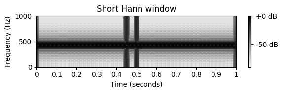
시간 및 주파수 인덱스에 대한 해석
시간 차원의 경우, 각 푸리에 계수 \(\mathcal{X}(m,k)\)는 초 단위로 주어진 물리적 시간 위치와 연관된다. \[\begin{equation} T_\mathrm{coef}(m) := \frac{m\cdot H}{F_\mathrm{s}} \end{equation}\]
예를 들어 가능한 가장 작은 홉 크기 \(H=1\)의 경우 \(T_\mathrm{coef}(m)=m/F_\mathrm{s}=m\cdot T~\sec\)를 얻는다. 이 경우 DT 신호 \(x\)의 각 샘플에 대한 스펙트럼 벡터를 얻으므로 데이터 양이 크게 증가한다.
또한, 하나의 샘플에 의해서만 이동된 섹션을 고려하면 일반적으로 매우 유사한 스펙트럼 벡터가 생성된다. 이러한 유형의 중복성을 줄이기 위해 일반적으로 홉 크기를 윈도우 길이 \(N\)에 연관시킨다. 예를 들어, \(H=N/2\)를 선택하는 경우가 많으며, 이는 생성된 모든 스펙트럼 계수를 포함하는 데이터 크기와 합리적인 시간의 분해 사이의 좋은 trade-off이다.
주파수 차원의 경우 \(\mathcal{X}(m,k)\)의 인덱스 \(k\)는 물리적 주파수에 해당된다.
\[\begin{equation} F_\mathrm{coef}(k) := \frac{k\cdot F_\mathrm{s}}{N} \end{equation}\]
T_coef = np.arange(X.shape[1]) * H / Fs
F_coef = np.arange(X.shape[0]) * Fs / N

plt.figure(figsize=(3, 4))

plt.subplot(2, 1, 1)
plt.plot(t, x, c='k')
plt.xlim([min(t), max(t)])
plt.xlabel('Time (seconds)')

plt.subplot(2, 1, 2)
left = min(T_coef)
right = max(T_coef) + N / Fs
lower = min(F_coef)
upper = max(F_coef)
plt.imshow(Y, origin='lower', aspect='auto', cmap='gray_r',
           extent=[left, right, lower, upper])
plt.xlabel('Time (seconds)')
plt.ylabel('Frequency (Hz)')
plt.tight_layout()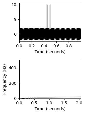
패딩 전략(padding strategy)
- 윈도우 크기 \(N\in\mathbb{N}\)로 STFT를 사용할 때 패딩의 두 가지 측면을 고려할 수 있다.
첫 번째 윈도우의 중심은 신호의 샘플 인덱스 \(N/2\)에 해당한다. 하지만 \(0\)의 시간에 해당하는 첫 번째 윈도우을 생각하는 것이 편하다. 이를 달성하기 위해 신호 시작 부분에서 \(N/2\) 샘플을 채울 수 있다.
마지막 윈도우의 시간 범위는 신호의 시간 범위에 완전히 포함된다. 따라서 신호의 끝 부분은 신호의 나머지 부분만큼 많은 겹치는 윈도우로 덮이지 않는다. 이에 대응하기 위해 신호 끝에 패딩을 사용할 수 있다. 필요한 패딩의 정확한 양은 홉 크기와 창 크기에 따라 다르다. 그러나 실용적인 이유로 \(N/2\)의 패딩 길이를 다시 사용하는 경우가 많다.
- 패딩 전략 중 하나는 신호를 0으로 확장하는 것이다(제로 패딩). 다른 전략은 각각 첫 번째 샘플과 마지막 샘플의 신호를 미러링하여 샘플로 신호를 확장하는 것이다(반사 패딩). 여러 패딩 전략은
numpy.pad문서에 설명되어 있다.
Fs = 256
duration = 10
omega1 = 1
omega2 = 5
N = int(duration * Fs)
t = np.arange(N) / Fs
t1 = t[:N//2]
t2 = t[N//2:]

x1 = 1.0 * np.sin(2 * np.pi * omega1 * t1)
x2 = 0.7 * np.sin(2 * np.pi * omega2 * t2)
x = np.concatenate((x1, x2))

def pad_and_plot(t, x, Fs, pad_len_sec, pad_mode):

    pad_len = int(pad_len_sec * Fs)

    t = np.concatenate((np.arange(-pad_len, 0) / Fs, t,
                        np.arange(len(x), len(x) + pad_len) / Fs))
    x = np.pad(x, pad_len, pad_mode)
    N = len(x)

    plt.figure(figsize=(6, 1.5))
    ax1 = plt.subplot(1, 2, 1)
    plt.plot(t, x, c='k')
    #plt.xlim([t[0], t[-1]])
    plt.xlim([-1.0, 11.0])
    plt.xlabel('Time (seconds)')
    plt.ylabel('Amplitude')

    ax2 = plt.subplot(1, 2, 2)
    X = np.abs(np.fft.fft(x)) / Fs
    freq = np.fft.fftfreq(N, d=1/Fs)
    X = X[:N//2]
    freq = freq[:N//2]
    plt.plot(freq, X, c='k')
    plt.xlim([0, 7])
    plt.ylim([0, 3])
    plt.xlabel('Frequency (Hz)')
    plt.ylabel('Magnitude')
    plt.tight_layout()
    plt.show()

    return ax1, ax2

print('No padding:')
ax1, ax2 = pad_and_plot(t, x, Fs, 0.0, 'constant')

print('Zero padding:')
ax1, ax2 = pad_and_plot(t, x, Fs, 1.0, 'constant')

print('Reflect padding:');
ax1, ax2 = pad_and_plot(t, x, Fs, 1.0, 'reflect')
No padding: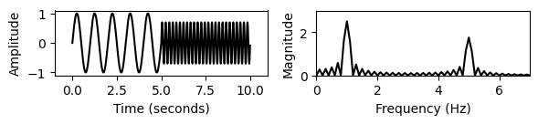
Zero padding:
Reflect padding: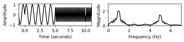
- 서로 다른 패딩 전략을 사용하면 해당 스펙트로그램의 시작과 끝이 달라진다. \(N/2\)보다 작은 홉(hop) 크기를 사용하는 경우 시작과 끝 모두에서 둘 이상의 프레임이 영향을 받는다.
- 다음 그림은 에지 현상 (edge phenomena) 을 보여준다.
def compute_stft(x, Fs, N, H, pad_mode='constant', center=True, color='gray_r'):
    X = librosa.stft(x, n_fft=N, hop_length=H, win_length=N,
                     window='hann', pad_mode=pad_mode, center=center)
    Y = np.abs(X) ** 2
    Y = Y / np.max(Y)
    return Y

def plot_stft(Y, Fs, N, H, time_offset=0, time_unit='frames', xlim=None, ylim=None, title='', xlabel='', color='hot'):
    time_samples =  np.arange(Y.shape[1])
    if time_unit == 'sec':
        time_sec = np.arange(Y.shape[1]) * (H / Fs) + time_offset
        extent=[time_sec[0]-H/(2*Fs), time_sec[-1]+H/(2*Fs), 0, Fs/2]
        xlabel='Time (seconds)'
    else:
        time_samples = np.arange(Y.shape[1])
        extent=[time_samples[0]-1/2, time_samples[-1]+1/2, 0, Fs/2]
        xlabel='Time (frames)'
    plt.imshow(Y, cmap=color, aspect='auto', origin='lower', extent=extent)
    plt.ylim(ylim)
    plt.xlim(xlim)
    plt.xlabel(xlabel)
    plt.ylabel('Frequency (Hz)')
    plt.title(title)
    plt.colorbar()
N = 512
H = 128
xlim_frame = [-2, 22]
xlim_sec = [-1, 11]
ylim_hz = [0, 8]
plt.figure(figsize=(10, 6))
# No padding
Y = compute_stft(x, Fs, N, H, pad_mode=None, center=False)
plt.subplot(3, 2, 1)
plot_stft(Y, Fs, N, H, xlim=xlim_frame, ylim=ylim_hz, title='No padding')
plt.subplot(3, 2, 2)
plot_stft(Y, Fs, N, H, time_offset=N / (2 * Fs), time_unit='sec', xlim=xlim_sec, ylim=ylim_hz, title='No padding')
# Zero padding
Y = compute_stft(x, Fs, N, H, pad_mode='constant', center=True)
plt.subplot(3, 2, 3)
plot_stft(Y, Fs, N, H, xlim=xlim_frame, ylim=ylim_hz, title='Zero padding')
plt.subplot(3, 2, 4)
plot_stft(Y, Fs, N, H, time_unit='sec', xlim=xlim_sec, ylim=ylim_hz, title='Zero padding')
# Reflect padding
Y = compute_stft(x, Fs, N, H, pad_mode='reflect', center=True)
plt.subplot(3, 2, 5)
plot_stft(Y, Fs, N, H, xlim=xlim_frame, ylim=ylim_hz, title='Reflect padding')
plt.subplot(3, 2, 6)
time_sec = np.arange(Y.shape[1]) * (H / Fs)
plot_stft(Y, Fs, N, H, time_unit='sec', xlim=xlim_sec, ylim=ylim_hz, title='Reflect padding')
plt.tight_layout()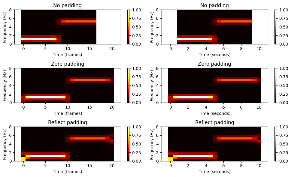
예시
피아노로 연주되는 C장조 음계를 보자.
스펙트로그램은 시간 경과에 따라 연주된 음의 주파수 정보를 보여준다. 각 음표에 대해 서로 위에 쌓인 수평선을 관찰할 수 있다. 이 같은 간격의 선은 음의 기본 주파수의 정수배인 부분에 해당한다. 더 높은 부분은 더 적은 신호 에너지를 포함한다. 또한 시간 경과에 따른 각 음의 감소는 수평선의 페이드 아웃으로 반영된다.
ipd.Audio("../audio/piano_c_scale.wav")fn_wav = "../audio/piano_c_scale.wav"
x, Fs = librosa.load(fn_wav)
H = 1024 # hop size
N = 2048
w = np.hanning(N)
X = stft_basic(x, w, H=8)
Y = np.abs(X) ** 2
eps = np.finfo(float).eps
Y_db = 10 * np.log10(Y + eps)
T_coef = np.arange(X.shape[1]) * H / Fs
F_coef = np.arange(X.shape[0]) * Fs / N
fig = plt.figure(figsize=(8, 5))
gs = matplotlib.gridspec.GridSpec(3, 2, height_ratios=[1, 2, 2], width_ratios=[100, 2])
ax1, ax2, ax3, ax4, ax5, ax6 = [plt.subplot(gs[i]) for i in range(6)]
t = np.arange(len(x)) / Fs
ax1.plot(t, x, c='gray')
ax1.set_xlim([min(t), max(t)])
ax2.set_visible(False)
left = min(T_coef)
right = max(T_coef) + N / Fs
lower = min(F_coef)
upper = max(F_coef)
im1 = ax3.imshow(Y, origin='lower', aspect='auto', cmap='gray_r',
extent=[left, right, lower, upper])
im1.set_clim([0, 1000])
ax3.set_ylim([0, 5000])
ax3.set_ylabel('Frequency (Hz)')
cbar = fig.colorbar(im1, cax=ax4)
ax4.set_ylabel('Magnitude (linear)', rotation=90)
im2 = ax5.imshow(Y_db, origin='lower', aspect='auto', cmap='gray_r',
extent=[left, right, lower, upper])
im2.set_clim([-30, 20])
ax5.set_ylim([0, 5000])
ax5.set_xlabel('Time (seconds)')
ax5.set_ylabel('Frequency (Hz)')
cbar = fig.colorbar(im2, cax=ax6)
ax6.set_ylabel('Magnitude (dB)', rotation=90)
plt.tight_layout()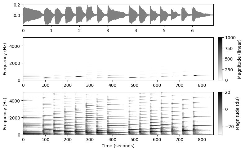
출처:
- https://www.audiolabs-erlangen.de/resources/MIR/FMP/C2/C2.html
\(\leftarrow\) 3.2. 이산 푸리에 변환 & 고속 푸리에 변환